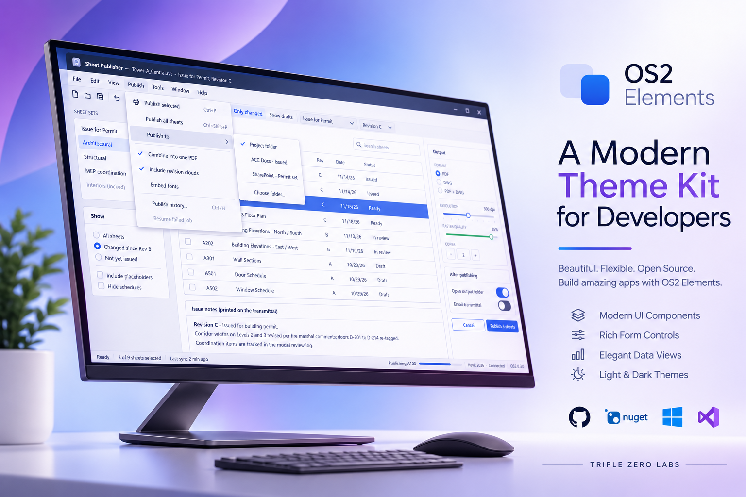
OS2 is our dependency-free WPF theme: plain resource dictionaries with no MaterialDesign and no MahApps. You merge one dictionary, and every standard control picks up a clean, modern look. Version 0.3.0 is out today. It covers the everyday controls that were still showing stock Windows chrome: menus, toolbars, status bars, radio buttons, sliders, list views and more. A whole app window can now be built without a single Style= attribute.
- NuGet: TripleZeroLabs.Os2
- GitHub: TripleZeroLabs/TripleZeroLabs.Os2, see the v0.3.0 release
dotnet add package TripleZeroLabs.Os2 –version 0.3.0
What’s new
As before, these are all implicit styles. If OS2 is already merged into your app or window, they apply as soon as you upgrade.
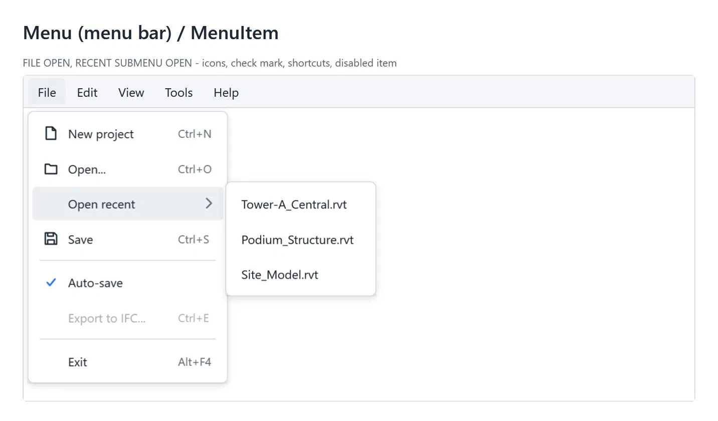
Menu bar, with icons, check marks and submenus
The Menu bar is a light strip with rounded top-level items. Its drop-downs share the context-menu look, and menu items now support icons, check marks, shortcut text and nested submenus. That works in context menus too.
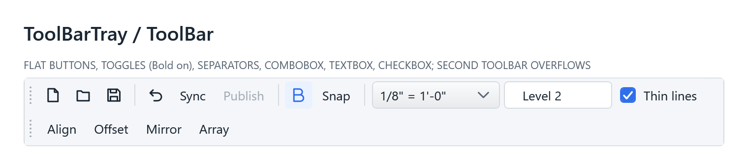
ToolBar and StatusBar
Toolbars get flat icon buttons, toggles that highlight blue when on, thin vertical separators and an overflow drop-down. ComboBoxes, text boxes and checkboxes keep the OS2 look inside a toolbar. Status bars are a quiet strip with small grey text and the same thin separators.

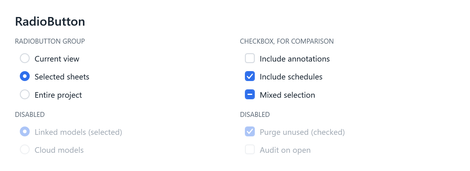
RadioButton and Slider
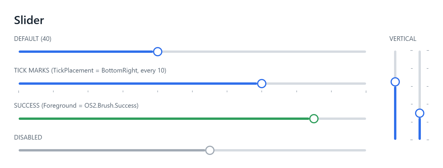
Radio buttons use the same row as the checkbox, with a round box that fills blue when selected. Sliders are a slim rounded track filled up to a white knob. Like the ProgressBar, the fill follows Foreground, so Foreground=”{DynamicResource OS2.Brush.Success}” turns one green. Tick marks and vertical sliders work too.
ListView, GridView and ListBox
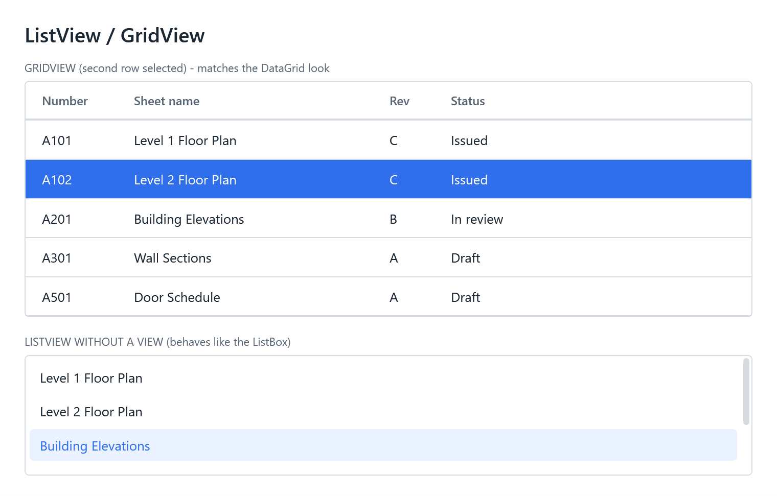
A ListView with a GridView now looks just like the OS2 DataGrid: bold grey headers, thin row dividers and a solid blue selected row, with resizable columns. It’s a lighter option for read-only lists. List boxes get rounded rows with a soft hover and a light-blue selection, matching the tree view.
GroupBox, RichTextBox and Separator
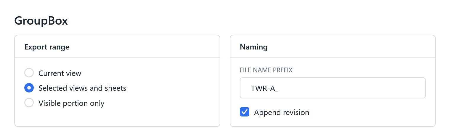
- GroupBox is a bordered card with a bold header, the same look as the Expander without the chevron.
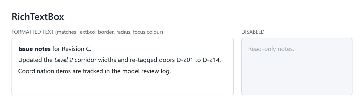
- RichTextBox matches the text box, as a multi-line editor with tidy paragraph spacing.
- Separator draws a thin line anywhere, and OS2.Separator.Vertical gives you a vertical one for button rows.
- RepeatButton is an outlined button, handy for +/− steppers.
Updated AI-assistant skill
OS2 ships an agent skill, os2-wpf-theme, that teaches Claude Code and other AI coding assistants how to use the theme correctly. It’s updated for 0.3.0:
- The list of automatically styled controls includes every new control.
- The resource-key reference documents the new controls in detail, with a menu example (icons, check marks, shortcuts), the vertical separator, and when to use a ListView instead of the DataGrid.
- It lists the new base styles you can build your own controls on.
- The skill now loads when you work with radio buttons, sliders, list views, group boxes, menu bars, toolbars and status bars.
If you copied the skill into your project earlier, copy it again to pick up the changes. The README explains how.
Also in this release
- Context-menu separators are fixed. They had been invisible since 0.1 and now draw a thin line.
- Glyph icons work everywhere. OS2.Path.Glyph now follows the surrounding text colour, so the same icon works on a button, in a menu, and in white on a selected row.
- Building blocks you can reuse: shared base styles for text inputs, checkbox-style controls and list rows, listed in Os2ResourceKey.Base.
- Signed DLLs. As with 0.2, every DLL is signed by Triple Zero Labs LLC, and the GitHub release includes a zip of the DLLs for .NET Framework 4.8, .NET 8 and .NET 10.
- Since 0.2.0: the 0.2.1 hotfix stopped Os2MessageBox from crashing inside host apps such as Revit. Inside a host app, pass your own window as the owner.
Heads-up when upgrading
- List boxes change look. They now have rounded corners and themed rows instead of the Windows highlight.
- Every Menu, ToolBar, StatusBar, GroupBox, RadioButton, Slider and ListView in a themed window picks up the new styles. Check any screen that relied on the default Windows look for those controls.
The full list of changes is in the changelog.
Try it
Install from NuGet. To see every control and state live, clone the repo and run the gallery app. It now includes a small app frame with a working menu bar and toolbar:
cd TripleZeroLabs.Os2.Gallery
dotnet run
Issues and ideas are welcome on GitHub.
Leave a Reply