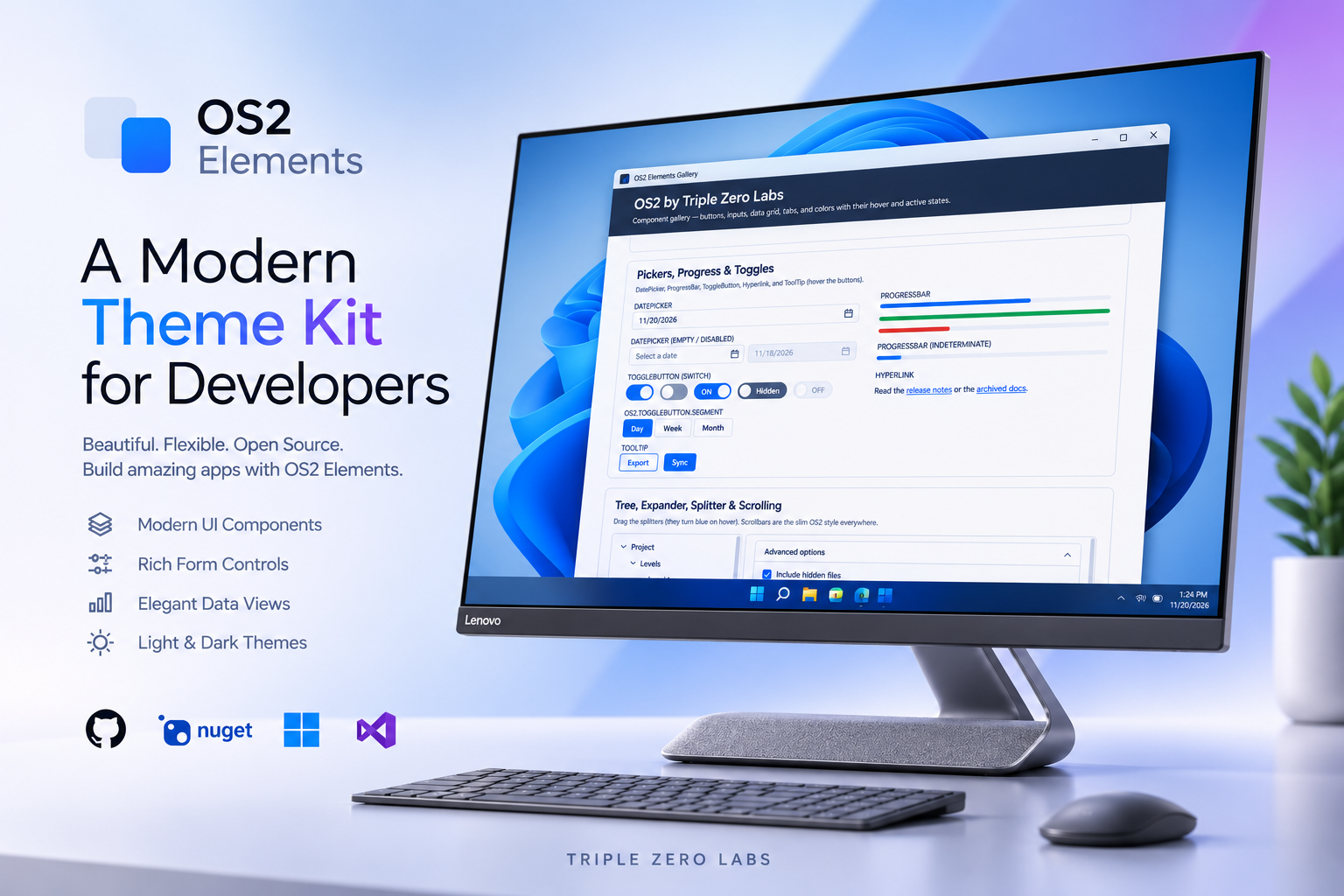
OS2 is our dependency-free WPF theme: plain resource dictionaries with no MaterialDesign and no MahApps. You merge one dictionary, and every standard control picks up a clean, modern look. Version 0.2.0 is out today. It brings OS2 styling to ten more controls, so most screens no longer need a single Style= attribute.
- NuGet: TripleZeroLabs.Os2
- GitHub: TripleZeroLabs/TripleZeroLabs.Os2, see the v0.2.0 release
dotnet add package TripleZeroLabs.Os2 --version 0.2.0What’s new
All of these are implicit styles. If OS2 is already merged into your app or window, they apply as soon as you upgrade.
DatePicker and Calendar
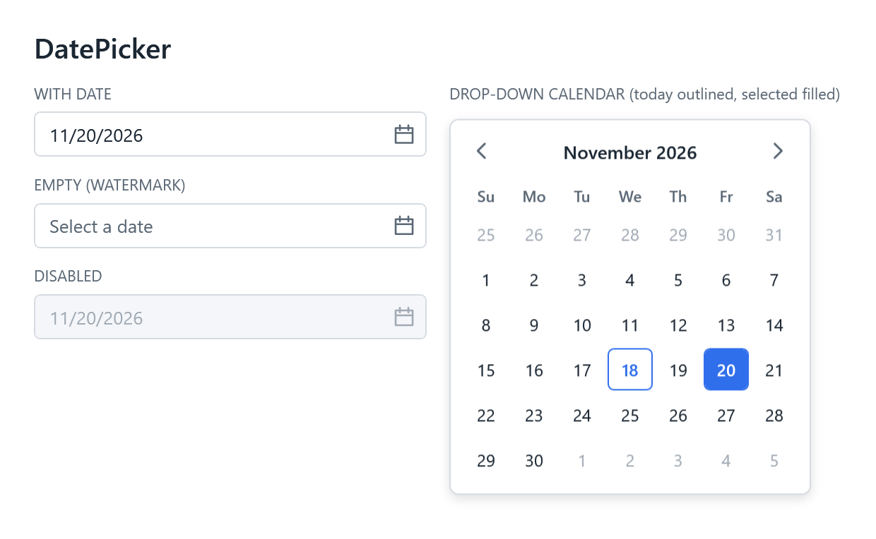
The DatePicker now matches the OS2 text box and gets a calendar icon button. The drop-down calendar uses rounded day cells: today is outlined, and the selected day is solid blue.
ToggleButton is now a switch
Toggles are now a single sliding switch: dark grey when off, blue when on, with an animated knob. Labels sit inside the track, on the side opposite the knob. Content is the “on” label and Tag is the “off” label:
<ToggleButton Content="ON" Tag="OFF" IsChecked="{Binding ShowGrid}" />Need the old button-shaped toggle for a Day / Week / Month picker?
Style="{StaticResource OS2.ToggleButton.Segment}"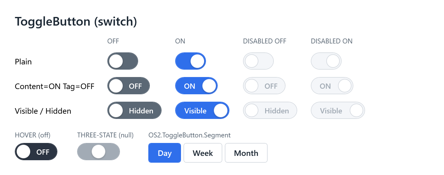
TreeView and Expander
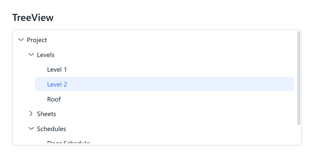
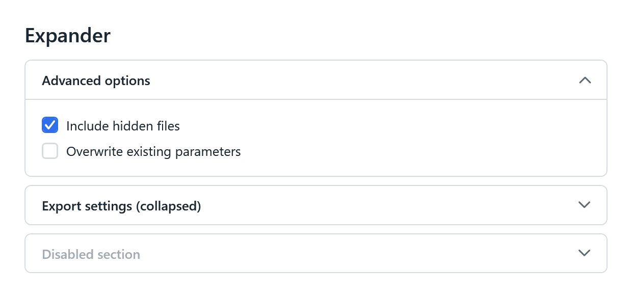
Trees get rotating chevrons, rounded hover rows and a light-blue selection. Expanders become bordered cards with a bold header and a chevron that flips when open.
ProgressBar and ToolTip
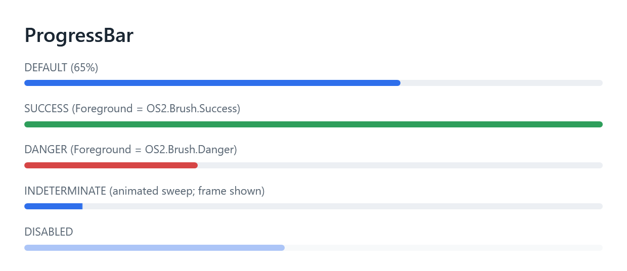
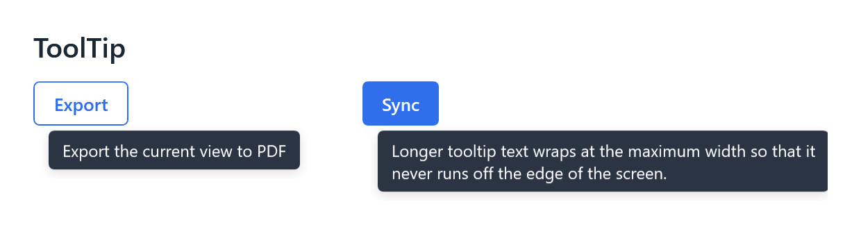
Progress bars are a slim 6 pixels with rounded ends. The fill follows Foreground, so Foreground="{DynamicResource OS2.Brush.Success}" turns one green. Indeterminate bars animate a smooth sweep. Tooltips are dark bubbles with a soft shadow.
Scrollbars, GridSplitter and Hyperlink
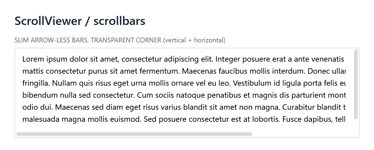
- Scrollbars are slim, have no arrows, and use a rounded thumb. They apply everywhere: lists, data grids and drop-downs.
- GridSplitters are a grey line that turns blue on hover and while dragging.
- Hyperlinks are blue and underline on hover. Disabled links stay underlined in grey, so they still read as links.
Updated AI-assistant skill
OS2 ships an agent skill, os2-wpf-theme, that teaches Claude Code and other AI coding assistants how to use the theme correctly. It’s updated for 0.2.0:
- The list of automatically styled controls now includes all ten new controls.
- The resource-key reference covers the new switch (Content / Tag labels and the segmented style), the icon button, the shared chevron and calendar glyphs, and the GridSplitter sizing rules.
- The skill now loads when you work with DatePickers, progress bars, switches, tree views, expanders and tooltips.
If you copied the skill into your project earlier, copy it again to pick up the changes. The README explains how.
Also in this release
- New building blocks you can reuse:
- OS2.Button.Icon, a square, transparent button for icon-only actions
- chevron and calendar glyph geometries
- a shared popup shadow
- a common OS2.ButtonBase style that every button variant now inherits from
- Signed DLLs. Every DLL is Authenticode-signed by Triple Zero Labs LLC, which helps with Smart App Control and plugin hosts that block unsigned code.
- DLLs on GitHub. The GitHub release includes a zip of the signed DLLs for .NET Framework 4.8, .NET 8 and .NET 10, if you reference assemblies directly.
Heads-up when upgrading
- Every scrollbar in a themed window now uses the slim OS2 style. That’s usually what you want, but check any screen that relied on the default Windows scrollbars.
- ToggleButtons now render as switches. If you used ToggleButtons as push-style toggles, add Style=”{StaticResource OS2.ToggleButton.Segment}” to keep that look.
- Drop-down and context-menu shadows are now shared, and very slightly softer.
The full list of changes is in the changelog.
Try it
Install from NuGet. To see every control and state live, clone the repo and run the gallery app:
cd TripleZeroLabs.Os2.Gallery
dotnet run
Issues and ideas are welcome on GitHub.
Leave a Reply